Thursday 6 September 2018

Something Good Comes Out of South London

The Great North Wood - Tim Bird (Avery Hill Publishing, 2018) 

A thoughtfully written and wonderfully drawn graphic journey that charts the history, geography and mythology of a part of London that is often overlooked, yet amongst one of Britain's most radically developmental areas. And if you think all that doesn't sound like your cup of tea, then I'm here to tell you that this is one of the most beautiful, unique and fascinating books I have read for a very, very long time.

"I remember when this was all trees."
Southern Comforts

You really do need to pace yourself with this book, or it will be over far too soon. Everything (and I mean everything!) within these pages is so deliberate that you need to stop and take it all in; you must read, observe, admire, contemplate... and your experience will be all the better for it.

I should begin by admitting that I am in actual fact a proud South Londoner, born and bred. Even though it used to be a terrible fucking place, I loved it! None of the territories mentioned throughout the book are therefore new to me, but do you know I never stopped before to consider how they got their names?... or where the legends originated from, or that there even were any at all for that matter. However, you don't need to be familiar with the area to enjoy this story at all. To concentrate your attention solely on its specific geographical location would be to miss the point somewhat.

Fortunately, the map doesn't extend as far down to Pratt's Bottom, in Kent.
Once Upon a Forest

The narrator and protagonist of this psychogeographic novel is a woodland fox, the kind you see roaming around the dark, empty roads of suburban dwellings very late at night. But this is of course no ordinary fox, this is everyfox, and his point of view is that of a being that is as ancient as the land he inhabits. The creature observes the changes in the landscape with a naive curiosity, yet demonstrates a greater depth of wisdom than all the people that have come and gone before him.

Indeed, even whilst reading through this book, you cannot help but sometimes feel like an intruder. You get the real sense of something far greater than you could possibly ever have imagined, and even important historical events pale to insignificance in the broader scheme of things. The shift in perspective is both alarming and at the same time exhilarating, yet completely necessary and unexpectedly comforting. When you get to the last page, you will realise why.

It would be far too easy to dismiss the underlying message of this account as an environmental commentary, but it is actually far more complex than that and considerably less provocative actually. It concerns the very soul and spirit(s) of a wide expanse of woodland that defines what we now recognise as South-East London. The context of the story itself is of course not entirely specific to the location, and provides a very interesting and original way of portraying the narrative.

There are some truly memorable panels and sequences throughout this book, such as the irony of the recurring chicken takeaway box, the eerie apparition of white moose gods and goddesses, and that totally surreal part of the guy with the fox mask. Keen-eyed readers may even spot a Hitchcockian cameo appearance of the author himself and his young family, as they enjoy a walk through what remains of the forest.


Twentieth Century Fox & Chicken
After the Fox

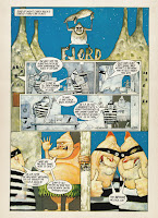
The comic is entirely hand-drawn and hand-lettered in such a beautiful, naturalistic style that it would be hard to imagine The Great North Wood having worked as well any other way, or by anybody else. It has such a delicate yet bold line to the work, that makes the art as soothing and mystical as it is abruptly descriptive. There is an organic iconography to the drawings that faithfully recreate each and every place we visit, with a spartan use of deliberately effective pen strokes.

That's not Nelson Mandela House, I've already googled it.
The artwork itself is a kind of classic Franco-Belgian ligne claire, but done in a folky style. There are some interesting uses of panel formation, flows and animation, as well as a couple of carefully placed maps and infographics. Although Tim Bird's technique is utterly original and uniformly consistent, I am occasionally reminded of aspects of what made some of Chris Ware's early work so delightful. However, there are also aesthetic similarities in poetic tone and melancholy to Jon McNaught's Dockwood; another beautiful book that I've been aware of for some time, but have yet to read.

Indeed, what really makes this graphic novel stand out visually is the clever use of an expertly minimalist, colour-coded palette that draws the breath as it leads the eye. The burnt orange tones act as a foreground overlay so that you are immediately encouraged to identify with the canidine protagonist, and your subconscious mind will consequently associate the same colour to other salient points of impact within each panel. The complimentary pinks not only break the pages up nicely, but are also used to depict natural elements against the harsh backdrop of blue tints which, in turn, typically represent man-made and artificial structures. White is utilised infrequently as a descriptive colour, but to imply a spirituality of great significance. Everything is ultimately tied together nicely by the strong yet unobtrusive navy blue ink; the colour of depth, wisdom, imagination and intelligence.

The call of nature within nature's call.
Mum's the (Final) Word

After I had finished with this book, I leant it to my mum to read. As far as I know, she had never picked up a comic before in her life, yet found it totally enthralling and was still in a state of some elation when I went round to pick it up the following afternoon.

Admittedly, she had a subjective interest in the content, being from South-East London herself, and was particularly impressed by the personalised message and sketch on the first inside page (thanks Tim!). I was nevertheless assured that she had enjoyed it very much, and found it as interesting and enchanting a read as I had.


A big thanks also to my good chum Tony Esmond for being kind enough to pick me up a copy. If you want to read a proper blog about comics, then you will find him here, as always.

Be sure to order your own edition of The Great North Wood here, and check why not check out some other goodies from Avery Hill Publishing whilst you are at it.

Follow Tim Bird on Twitter, and find out more about what he's up to here.


All visual content is for demonstrative purposes only and is the property of the respective owners.

Friday 10 August 2018

Review: Smash, Pow, Wham!... It's The Splank Generation

Splank! - Issue 1 (Peter Duncan, 2018) 

So you think that comics like Smash, Crunch and Wallop* are strictly a thing of the past, do you? Well think again, Buster: the onomatopoetically titled humour anthology is back in Action, Nutty as ever, and it's a Cracker!
*Not an actual comic
The Splankety-Splank chequered book history and pen(guin).
The Origins Issue

You may find that the word "splank" itself has several unsavoury meanings such as: a messy ejaculation that did not go as intended, taking a bloody shite, having a spliff and a wank at the same time, and the act of a penis being slammed. However, editor and publisher Peter Duncan assures us that it has actually gone down on record as the sound that is made of someone being hit over the head with a wet plank ...and thank God for that!

There is a rather quaint and amusing little (fictional) backstory to how this comic came about which I feel needs to be told in the creator's own words, so here is the introduction copy & pasted directly from the Splank! website:
An interesting oddity and a perfect example of what may have gone wrong with the Odhams line, Splank! was a short-lived Irish version of Pow! It replaced the main title from issue 32 through to number 34. Someone, probably an Englishman on the Odhams Staff, was concerned that Mike Higgs' Cloak strip, was featuring a villain called "The Leprechaun", something thought not likely to go down well in 1960’s Ireland. 
At the time Irish/ British relations were not great and there had been complaints in the Irish press, mainly in the Sunday World, about the stereotyping of Mick the Marmaliser of Ken Dodd’s Diddymen as a violent, bad-tempered redhead. Indeed Dodd had been forced to cancel a series of shows in Dublin following the controversy, with the IRNPA (Irish Redhead National Provincial Army) threatening his life. 
Pow! was the best-selling comic in the Irish Republic at the time and Odhams were worried that the loss of Irish sales could be critical to the survival of the title. It was felt to be worth re-lettering the Cloak strip to remove what could have been seen as anti-Irish sentiment and retitling the comic to make it more Irish. Splank! was believed by the editors, totally incorrectly as it happens, to be an english version of an Irish word for bog oak. It had been used to denote the sound of “a man being struck over the head with a wet plank” on Irish TV in a sketch on The Late, Late Show parodying the immensely popular Batman TV show. 
The first issue of Splank!, numbered no. 32, went on sale in September 1967 and sank without trace. Careless production led to an early joke cover being used, one which used language not deemed suitable for children. The failure to change the banner from ‘Britain’s’ to ‘Ireland’s Super-Hero Action Comic’ meant that The Sunday World had another front page story. The title lasted only three, very badly distributed, issues before fading into oblivion. 
Copies of Pow! were transported from the North and were much more popular that the ersatz Splank! For a month it overtook butter as the item most often smuggled across the border with Northern Ireland. Not many issues survive and I came across this one in a bundle of old comics at a second hand book shop in west Cork owned by a sailor with a wooden arm. Irish comics fans all know about Splank!, but few are willing to talk about it, there are so few copies in circulation that we want to keep them all for ourselves, but word has got out and this article, published on April 1st, is our way of casting doubt on the reality of the comic. But we know lads, don't we?
You wouldn't think it, but Ninja Monkey is actually deadlier than a silent bottom burp.
The Power (Comics) of Love

As if it wasn't already clear, Splank! is a contemporary comic anthology in the style of the classic Power Comics weeklies that were published by Odhams Press in the late 1960s. It's a personal project that attempts (more than adequately) to envisage how comics such as Smash!, Wham! and Pow! would be presented nowadays, whilst keeping within the traditional brand guidelines that made these publications so popular in the first place.

The production values are considerably higher than the originals, and printed largely in full-colour/greyscale, on thick, semi-glossy magazine paper. There is little chance of this publication turning into brittle, yellowed parchment fifty years from now.

The trademark navy blue line-art has been (mostly) disregarded in favour of a more conventional black ink, although the colour is affectionally referenced in the masthead, alongside the equally familiar red and yellow that were synonymous with the original comics. Readers (and connoisseurs) will also be grateful to learn that the poor colour separations and shoddy offset printing have also not been revisited. However, the front cover does endeavour to reconstruct the sepia colour and noisy texture of the old British weekly. It works rather well in this case, especially if you consider that this design technique is particularly tricky to pull off (and thus generally avoided) in most other contexts.

Ooh-hoo, everybody's talking 'bout the new kid in Spookytown.
P-P-Pick up a Grumpy Penguin

There is a really great, eclectic mix of strips inside the pages of this first issue Enniskillen Comicfest special edition. You're guaranteed something for everyone, and I really feel that a lot of effort has been put into maintaining that distinctly leftfield element that distinguished the Odhams line from other children's comics of the era.

That isn't to say that Splank! should be considered a children's comic... or perhaps it is. I tend to look at it as a something that appeals to the inner child, and should therefore be enjoyed by both youngsters (not too young, mind) and adults alike. Indeed, there is enough fresh air within the inner pages so as to appeal to everyone and anyone, as well as including more than a little something for the nostalgics. Nevertheless, an equal amount of care has also been taken to ensure that anyone who is not already familiar with the Power Comics' humour imprint of the 1960s, will not feel alienated.

I don't intend to go through each story of this anthology, as I fear that to do so would kind of ruin the surprise. Reading Splank! should be experienced as a journey, or an adventure. It's a bit like when you used to pick up one of these new and exciting weeklies for the first time; always wandering what not to expect, as you turned the pages to discover each brand new weird world of wackiness to sink your eyes into.

There is a running gag featured throughout some of the strips starring Peter Duncan's alter-ego, The Grumpy Penguin. The character is referenced in pretty much the same way that many Odhams and D.C. Thomson comics used to present and lampoon their own Editor, and to popular effect. You may also note the return of a couple of long-lost traditions I have always had a penchant for in classic comics: speech bubbles on the front cover, and a story that continues on the back page. Lovely!

The Best Within

To prove that this is anything but an amateur publication, there is very much an all-star cast feel to the list of contributors on this first edition of Splank! There's some excellent work from established artists and writers like Davy Francis, Dave Windlett, Nigel Parkinson, John Farrelly and Peter Duncan himself, as well as some fine stuff from indie press creators such as Marc Jackson, Morgan Eardley, Colin Sinclair, Cat Byrne, Glenn Matchett, Morgan Brinksman, Scott Twells, John Robbins, Alan Nolan, Mal Coney and Andrew PawleyA mention should also go to the extremely nice work from established colourists Ellie Wright and The Beano's own Nika Nartova, letterer Patrick Brown, and the feature presentations of Michael Carroll. However, the star attraction has to be Mike Higgs and the most welcome return of his iconic strip featuring The Cloak, which is worth the entrance fee alone.

Each and every strip is very different in style and content, and are remarkable in their own way. I personally enjoyed them all and found redeeming features within every single one, as well as that edgy, slightly surreal and offbeat quality that is consistent throughout the entire comic.


Amongst the many highlights, there is also an interesting little piece called Cthulhu Kids which has all the hallmarks of a successful standalone character licence, but my own personal favourites are Dresden Q. Otherside and Walter Wonder, which I feel are two features in particular that really capture the essence of what Pow! was really all about. However, the real standout strip for me is most definitely Mouse, which is like an IT version of Calculator Kid from the pages of Whoopee!, or Vid Kid from later issues of Buster. What really makes it though is the seemingly bizarre randomness of the strip, the slender adult theme and the indisputably dark undercurrent, all presented with the long-lost brio of former strips like The Group or of Leo Baxendale's work for Odhams. Fabulous stuff!


Ethel Dead is a tale of sibling skull-duggery that is sure to get into your head.
The Finished Article

I heartily recommend this comic anthology; it really is something special, and loaded with a wide range of strips from new talent and old hands alike. As far as I am aware, there is nothing else like it around, and possibly hasn't been since perhaps something like Oink! in the mid-1980s.

I really would have loved to have gone through and sang the praises of each and every story, writer and artist, but thought that to do so would spoil the magic. You really do need to pick up a copy and experience this anthology yourselves, as you would have done once upon a time; possibly along with a quarter of Kola Kubes, and of course with a slightly more developed mind...


The editor of Splank! Peter Duncan is also on the lookout for contributions for the next issue. Find out further details here.

You can visit Peter Duncan's Box of Rain Magazine website here, or go directly to the Splank! blog here.


For information on how to get your copy of Splank! now, go here.

Issue 1 of Cthulhu Kids should be out in September, so check out the Kickstarter campaign for more info, here.


All visual content is for demonstrative purposes only and is the property of the respective owners.

Tuesday 24 July 2018

I Teach You the Superman: A Comic for All and None

The Man in the Gutter - Dimitris Zach (Deadhead Comics, 2018) 

"Have you ever felt stuck somewhere in between? In between the route from your flat to work and vice versa? In between your desire to create and destroy? In between comedy and drama? In between the gutter? and if yes, what did you do?..." Well, I'll tell you what I did; I decided to go and find out a little bit more about one of the indie comic scene's brightest rising talents.

"Man", "in between", "gutter"... get it?
I was already thoroughly impressed with this comic the first time I saw it and it just gets better with each subsequent reading, a bit like every time you rewatch Withnail and I. The title may or may not have been taken from the song lyrics of "Disparity By Design" by hardcore Chicago band, Rise Against. It probably was, but even if it wasn't, it should have been:
"If we just took a step back, a bigger picture we might view, perhaps the man in the gutter is not so different from you."
Not only does this line work as a general concept for the story, but the more alert among you may  have noted that the term "gutter" also refers to the white void between panels. Indeed, this creator gets right "in between" the fabric of comics, and their language, by attacking the space in and around the fourth wall, bringing the audience, the author, and the character(s) together into one single dimension, and where no-one is safe!

Every Story Tells a Picture

Dimitris Zach has a clearly distinctive illustrative technique and attractive cartoon style that would not look out of place in an expensive alternative comicart anthology. You could imagine seeing his work signed up to the Fantagraphics label, or to a European undergrind publisher, yet it also has something unmistakably British about it too.

There's a grotesque element to his art that recalls Peter Bagge's earlier work, a surreal impact to his forms that is reminiscent of Hunt Emerson, and a chiaroscuro treatment that resembles that of José Muñoz. Indeed, Dimitris' heavy inking really gives this book a distinguished noir feel, as if you are watching something terribly uncomfortable unfolding before your very eyes, and is all the more effective alongside the burlesque nature and content of his panel art.

There is also a great flow to his panels; so good in fact, that your eyes almost travel across the page too quickly and easily. Once you force yourself to slow your visual/mind coordination right down (or by simply rereading the book carefully), you will begin to notice a wealth of experimental techniques. No two layouts are the same; there is something new to behold on every page, and the fact that it doesn't hit you right away means that it works just perfectly.


...No problem, just get to the end and read through the comic again carefully.
The Painter and the Apple

There's various levels of high meta concept within the narrative, although the story itself also plays out straight well enough ...at least to begin with anyhow. The father/son apologue that runs inherently throughout the comic will be something that most people (possibly even the artist himself) may relate to. Upon subsequent consideration however, it becomes increasingly apparent that the roles are not as clear cut as they may seem, and that this notion is in fact more likely a metaphor for the relationship between the creator and his creation.

Furthermore, the references to God suggest that the allegory could be extended beyond mere artistic propinquity, and serve therefore as a commentary on the existentialist perception of the human condition. Naturally, one immediately draws parallels with the philosophical doctrines of Nietzsche and, therefore to some extent, Schopenhauer. However, moving back into a strictly artistic context, I am reminded of Lawrence Gowing's Painter and Apple from 1983. In this piece, the British painter/critic imagines his still life talking back to him, with the result that it is not satisfied with his efforts.

"Imagine! I waited here confident in the knowledge of my luminous perfection. But where your eyes should have raped me, they did me justice."
It is possible that I may have got it all completely wrong, but that's the beauty of experiencing such a challenging and innovative piece of work; it gets you thinking about what you are reading, and you take your own conclusions away from it.

Oh well, back to the old drawing board then.
The Artist Interrogated

So that's enough from me anyway, let's move on to the real reason why you are here: to read something, in his own words, about a greatly talented storyteller and artist that is surely destined for greater things.
Hello Dimitris and thank you for taking the time to answer these few questions. Tell us a little bit about yourself, and what made you decide you wanted to get into making your own comics.
Hello Mauro! First of all I would like to thank you for showing interest in my work, getting in touch for this interview and spending your spare time promoting the indie scene! (I know you say you started the blog for selfish reasons, but hey... every single one who reads this knows how it feels being trapped in the love for comics).
Ok! Let’s see how this goes... I am 27 and the last 3 years of my life have been spent in Edinburgh since I moved there to avoid the Mediterranean unemployment and to try and join the Illustration Department of ECA (Edinburgh College of Arts), another story of inevitable rejection. But still here, one of the southern-blooded creatures of this city... and when I say south, I mean deep south! (everyone from the south knows what I mean).
I was born and raised in a place called Amaliada, located somewhere in the Peloponnese, close to Porto Patrasso which connects Greece and Italy, and is also the starting point of the boat to the Everyday Friday island for the British (Zante). A place that still has a different square for immigrant workers and incidents like dragging them behind tractors for reasons like stealing chickens from a back garden, or when the unions are protesting for better working (or more like, life) conditions. Farmers come out with rifles while spraying their teeth silver and screaming "what a day, what a lovely day".
Childhood, sweet sixteen and a jump into adulthood defined by diarrhoea (literally), unemployment or unpaid blue collar jobs because...Greece, whatsoever, more boring stuff... oh! and this stupid mandatory 9-month army training (psychotic depression! Rendered incapable to complete the training! Wooo-hooo!) and some anger issues coming out as scribbles, or as Freud described it "the mirror of the subconscious" right before he screamed something about my mother’s vagina... so fuck it! There must be a better way of psychoanalysis.
It was about 5 years ago when I met the person who would become my personal Mr. Miyagi: a 60 year-old cranky cartoonist answering to the name of Andreas Angelopoulos, who refuses to publish any of his work and the only trace of him you can find is in some forgotten 'zines that some of his students might have published. I knew he was teaching comics for a living but for me it was a period of crashing on friends' couches... I asked him if he could have a look into my first attempts at comics, and he said nothing about my work, he just asked if I would be interested to start. I replied yes, but I had no money so I offered cleaning his studio in exchange. I thought he would appreciate it... Now I think he just felt sad for my fawn... He told me to go back after a few weeks and bring some new work, so I did. We started meeting in his studio with a few more people for 4 hours a day, all of us from different backgrounds and with different perspectives: some liked manga, others superheroes, and most of them preparing their portfolios for studying abroad... I wasn’t sure what I wanted to do, to be honest. After a few months, while I was trying to understand what "sketch in basic shapes" meant, Andreas passed next to me and with a sardonic smile just left me a book of Robert Crumb... That was the moment in which everything started, in the most obscene and surreal way, to make sense. For the first 2 years we kept meeting daily for 4 hours, the last 3 we have been skyping once a week. 
PS: I never cleaned the studio. 
PPS: His son became one of my best friends. 
I've noticed that you also produce a number of illustrations, posters, etc. Does this tie in with your regular employment, or are you operating in your spare time, for the moment?... 
"Kid... comics will break your heart,’’ as my parents said many times quoting Kirby to me without even knowing it. In the last two years I had some paid projects: for storyboards, a board game, a few t-shirt designs and illustrations... But no, my regular employment were jobs that you qualified enough for if you have a pair of legs, arms and being relatively healthy enough to move fast. At the time, I am cleaning toilets, making beds at a hostel and the rest of the time I do comics. As you can imagine that means time for nothing else... In order to avoid isolation and keep in touch with stuff I like to support, I started producing these illustrations for DIY bands, 'zines, self-organised spaces/festivals, etc...
I'm aware of the fact that you are a big fan of European comics, and I know from speaking to you before that you have been inspired by the work of Italian cartoonist Zerocalcare. Have there been any other particular influences on your style and technique that you'd like to mention? 
Yeap! I discovered Calcare recently from a translated part of his work Kobane Calling and then I forced my partner to translate some stories from his blog for me that are only published in Italian. I was impressed by his observations and ability to connect social issues with pop culture and vice versa. 
My very first big influences were the American underground cartoonists, something you could totally see in my earlier works, like the Posthumous Experience of an Atheist and a few other 'zine works... Then I started getting impressed by the work of the Europeans, like Paul Grist or Bruno (Tyler Cross), that I used as references for The Man in the Gutter and illustrations mainly published in a collective magazine, at the time called 99 Percent Invisible. 
I don’t feel the drawing style of The Man in the Gutter is quite what I am trying to do though and for sure there are loads of things I still have to improve dramatically in every aspect of the process of making comics... so literally I just grab everything coming my way, from the perfect dialogues and characters of Daniel Clowes to the wide beautiful panels of Europeans and the impetuosity of 'zines. For my new projects I am trying to be focused on a more cartoony view of the European comics like Franquin, Philippe Foerster, Emmanuel Larcenet, Topolino cartoonists, Jacovitti, etc... And of course I am always peeking out on works of Greek, underground and indie cartoonists! 
So what other comics have you been brought up on, and what are you reading these days? 
Unfortunately I wasn’t a comic book guy from a young age and I am really jealous when listening about other cartoonists saying that they were into it from day one, copying characters, making stories and stuff. For sure I had some translated European titles like Asterix, Topolino, Lucky Luke, etc. but my memories as a child are more like my father singing guerilla songs to me or, when I was a bit older, showing me his Karl Marx books and trying to make me read them (of course I never read those bricks and I don't think that he has either. I think he just bought them as the cheapest encyclopedia collection from a random door-to-door salesman. God bless the Lumpenproletariat). 
In the last few years I have been trying to read a bit more thematically, depending on the project I am working on, as research! This is my phase of trying to understand how comedy works, from social commentary to silly cartoon gags and fart jokes (still the funniest). And because I take comedy as my coffee... I am reading comics like Ordinary Victories by Emmanuel Larcenet, Schizo by Ivan Brunetti, Arsenic Lullaby by Douglas Paszkiewicz, and then I have as a bible The Anthology of Black Humour: 45 writers referencing and analysing movies, books, plays and everything else that has to do with the genre. 
As well as being a big fan of your art, I feel you are also a very skilled writer. What part of the comic producing process do you enjoy the most, and which part do you enjoy the least? 
Thank you very much for your words Mauro and I am really happy you‘re saying that publicly! Now I can brag about having my first fan. Heh! The birth of an idea is what fascinates me the most and I get really excited about it... although the idea is just the first step of making a story and the excitement doesn't really help. 
One of my most common mistakes is that I don’t have a clear premise of this idea, as a result I have holes in the story, not being able to create strong characters, because they have no purpose, and a general chaos in my mind of how to transform this idea into a script... It’s difficult for me so that makes it the least enjoyable part of comics, although I think I am overcoming it, with Mr. Miyagi’s "uuuup... doooown...", painting the fence techniques of developing a script. Long conversations are a big help too with a really good friend and writer, as well as editor on The Man in the Gutter, Spyros V. and with loads of research and reading, I have started feeling more comfortable with it (I don’t know if it’s a good or a bad sign that the dialogues of my characters are now playing in my mind constantly). 
As you can understand, sketching comes at the end and, let's face it, I have not a natural talent. I am doing black and white, that is not really the most attractive thing for a big audience and anyway, there are soooo many good hands out there now that I cannot ever reach half of their level. So my goal is a relatively Ok drawing style with a good story! (I love sketching though mainly because it gives me time to listen to some comedy and podcasts). 
PS: All the above is a criticism on my approach into the process of comics, which I find interesting to talk about, then there is lettering... 
How did you come up with the idea for The Man in the Gutter, and the concept of "being stuck somewhere in between"? Although you were careful to distance yourself from the main character, is there anything of yourself, personal experiences, or observations within the story? 
I think it was when I realised that I would like to play a bit more with the language of comics and the possibilities it gives you. So I came up with the idea of a repressed autobiographical comic type character who wants to become a mainstream superhero. Then the idea of him being stuck in the gutters of a comic page just jumped out and the development of this idea brought me to the general conclusion that most of us are stuck somewhere in between... As I told you before, I get excited easily so I started developing the script without having quite clear in my mind where I was going. 
In order to fill some holes, I started referencing ideas from a book called Thus Spoke Zarathustra by Friedrich Nietzsche, in which he was explaining the process of becoming a superhero, kill your God, reborn as a child and recreate your values or end up a nihilist. (at least that’s what I understood). Anyway... the good thing is that I had made the same mistake already many times, so I knew how to manage it a bit better and not drown another story in my "never published" box. 
Distancing myself from the main character wasn’t an intentional action. If I could have been closer to him probably it would have been a better comic and the audience would be able to empathise more... That is something I am trying to improve in future projects. It happened mainly because of inexperience and I also was more focused on just telling the story! I haven’t read the comic since I published it and I was about to do before answering the last part of your question: if there is something personal in there... I have never thought about it and I don’t really want to know. I hope not! 
I also happen to know that you are about to launch a blog of short stories. I'm looking forward to seeing what you come up with there, so why don't you tell us a little bit more about this project too. 
It’s a project called Rough Time Comics, a series of autobiographical comics! And... I am gonna stop you here so don’t get me wrong, I know autobiographical comics can be boring, especially from a person like me, that has no strong opinions or ideology for a stable critic on any issue, or an interesting life, but I can promise one thing: there is no narrator telling you what to see and feel, no close ups full of dialogues and hell no, there is not even one cat in there. (I can’t draw cats anyway!) It's more like an opportunity to put some thoughts on paper, try to understand them and just share them with people around. 
Every story is based on real life experiences of mine, or of a friend of mine, with people I know or that I have met, or just seen on the street (and other loads of boring stuff that no one finds interesting except for me...) transformed into the world and language of comics. That mainly means that the one and only natural law of this world is surrealism and it is completely normal to find that The Teletubbies are your neighbours, your Uber driver is the guy from Back to the Future, or that your friends can literally jump from their panel to yours, ruining your life while you are being awkward trying to hit on someone. You have hypergalactic travels because this hippie you met at the park wants to win this stupid argument about afterlife; thoughts on neoliberalism, political correctness, this new trend of finding pleasure victimising ourselves, or being offended even by the air we breath. There are way more ideas recorded on my phone while on a break from mopping the floor of the hostel’s toilet and my colleagues will hear something like "if the conspiracy theorists are right and we do live in a predetermined Orwellian nightmare, controlled by the Illuminati or whatever, then for sure people like Trump and Milo are their stand-up comedians". 
Do you have any plans to produce further comics in the near future (please say yes!), or anything else in the pipeline that you'd like to talk about? 
I count the blog as comics in the near future... and that's mainly because every story that is online will be available on paper too... The idea is printing some issues of each episode and just leaving them around as free range comics, so everyone can find and read. The note on it will suggest to just pass it to someone else when you are done reading. 
The distribution will surely take place in 2 cities in the UK: Edinburgh, from the always supportive Deadhead Comics, and Manchester, by two very good friends and 'zine makers Frixos & Elli. Also in a few cities in Greece; Soul Traits magazine, E.T.K and Manos Ganas will distribute for me and then friends who just love me and respond positively to any stupid idea I have will help too. I hope to be able to do it in more countries and cities in the future... but well... first things first! 
Other than that, there is still a truck full of ideas, mainly plans of collaborations with friends, on poster series, comic strips, 'zines, t-shirts, and there is also a screen-printing toy project we are trying to plan called The Land in the Land!, so hopefully I will not die soon (today Steve Ditko died at the age of 90. Fucking hell, when I meant not soon I was thinking more like 60!) 
NB: I am sorry if my answers were too long already but before I finish, please allow me to shout out some people who have supported me, or supporting the DIY culture with their work: 
Soul Traits, a collective magazine of independent artists around Europe. (@soul.traits) 
Ekdoseis tou Kampou and Melandros Gana who is collecting the greek undergrounds and indie elite of cartoonist through his small press publications. (@ekdoseistoukampou) 
Winterview magazine based on DIY culture, with interviews on bands, record labels, fanzines and way more. (https://winterviewpunk.wordpress.com) 
Of course the guys from The Awesome Comics Podcast and the amazing support to every indie comic artist and cartoonist. (https://awesomecomics.podbean.com) 
Lulu AKA Always.Sidekicks.Drive, an amazing Greek illustrator and comic artist. (@always.sidekicks.drive) 
Bands like Kafka, Dirty Wombs and Chain Cult (if you are into punky mode) who are just running around, organising gigs, recording stuff and being supportive in general and many others that deserve to be mentioned and slipped my mind but I am sure you will find at some point. 
Thanks again for taking part in this, it's going to be great! Seeing as The Man in the Gutter is currently on sale, I guess I will need to be careful about what images I should include. Please do let me know if there are any specific panels you'd like me to use. I was thinking about 3 or 4 should do it, just to illustrate the article. 
Please feel free to use any images you like and also a link so everyone can download a full PDF of it! Nothing will change in my life if 20 more people buy it... and also, I hope everyone who reads it will want to support anyway, if not buying the actual book, at least contacting me for some feedback, trade our comics or start reading the blog. 
Count it as a present for the beginning of your blog, the approach you have and the space you gave me in it! I hope you enjoyed it as I do! I gave my best to keep it interesting and be as honest as possible. Thanks once again and you have my full attention in your future work! 
Thank you very much Dimitris, that is very kind of you indeed and I am certain that anyone reading this will not be able to wait to download a copy. Thank you once again for a very generous gesture. (Links provided at the bottom of the page). 
Behold, I teach you the Superman: he is that lightning, he is that madness!
The Bottom Line

I hope you all found the interview as interesting as I did, and I trust you will have enjoyed learning about this talented comic creator who has proved himself to be a modest, openly honest, considerate, intelligent and deep-thinking individual, as well as an all-round nice guy. I think Dimitris is a little too severe on himself in some areas, although I do sense a deep desire to constantly hone his craft, and to work hard on areas that require more attention... even if they are apparent no-one else but himself.

I've purposefully held back a little from piling on too many plaudits, because he is after all a young and relatively inexperienced comic creator. However, Dimitris has the world at his feet and I am certain that if he just carries on what he is doing, he will become a superhero too.


I shall personally look forward to tracking the career of Dimitris Zach, and am eagerly anticipating his next works. I've already seen a glimpse of another upcoming project centred around the concept of discarded ideas for comics, and feel that this will prove to be another cracker. To his credit, it is shaping up very much in a similar style to The Man in the Gutter, which you can download in all its glory right here.

Thanks once again to Dimitris for making the digital copy available to one and all. Please consider purchasing the hard copy too. I'm sure it will make a desirable addition to any small press collection and, if everything goes to plan, may even increase in value one day...

You can also catch up with Dimitris Zach, see what he's up to (you'll be glad you did!), and get in touch with him on his Instagram account here.

All visual content is for demonstrative purposes only and is the property of the respective owners.

Saturday 30 June 2018

Magazone: The Great Neon Film Strip Search

Neon - UK Movie Magazine (EMAP, 1996-1999) 

A rare look at the cartoons and artists that influenced and helped elevate this publication to British cult status. Warning: includes some of the most obscure comic material known to man; anyone who is sensitive to such matter is encouraged to look away now.

Neon - UK Movie Magazine (EMAP, 1996-1999)
Best of both worlds: flicking through the movie panels.
Funnies on the Slide

Do you remember when it was commonplace to find comic strips in magazines?... It really wasn't all that long ago. Publications of every description used to feature them regularly, and it was quite normal to expect to find one or two-page strips in everything from computer, movie, sport, TV and music magazines; right through to even the more specialist areas, such as the various gentlemen's interest periodicals that would populate the newsagent's top shelf (so I've been told!). Some of the British newspapers would even provide an American-style supplementary pull-out section of comics and cartoons, until about a decade or so ago. It would appear that even the classic funny strip has faced a gradual decline in many of the dailies too, over recent years, and is slowly dying out completely.

Neon was a short-lived, but well-loved monthly to the dedicated few that stuck with it throughout its run. Unlike established titles such as Empire, Sight & Sound, and (later) Total Film, it provided a more accessible and alternative look at the movie world. Neon concentrated much of its content on classic and cult cinema, with less hype surrounding blockbuster or mainstream releases. It didn't take itself (or the subject matter) too seriously, and also provided an important cultural subtext to its articles and reviews. The magazine appealed to the casual film fan, as well as to those with a more advanced interest in the medium. It provided a niche for readers who wanted to treat their passion with a refreshing and new outlook, and that was perhaps unavailable elsewhere.

I came in somewhere between the two levels of reader demographics, although my main reason for buying it was for the most abso-fucking-lutely brilliant posters they used give away free. In fact, that's what probably put them out of business. I was also a sucker for a good comic strip (and still am!). Neon had not one, but two humorous and superbly drawn strips for me to look forward to, and they were both just beautiful!

Neon - UK Movie Magazine (EMAP, 1996-1999)
The classic (remixed) cover to issue 9 of Neon, just to jog a few memories...
I lost all my copies of Neon in the great loft clear out disaster of '99. Finding out anything at all about these cartoomics, therefore, had proved an arduous and virtually impossible task; there is simply no information about them whatsoever. As a result, just finding details about one of the artists alone required a feat of deduction that would have even put Columbo to shame.

Berks - David Jukes (EMAP, 1996-1997)


The first comic strip we're going to take a look at was called "Berks", which is not only rhyming slang for an exceptionally rude word, but also a play on the popular Kevin Smith movie title of the time, "Clerks". This is the artist that I had tremendous difficulty in pinning down, even though he signed his work rather neatly in the bottom left-hand corner of the page. The main problem was that the small text was impossible for me to make out, in my surviving low-res scans of the strip. In the end, a complete shot in the dark led me to associate the art style with "Dave" Juke's illustration from a 1992 CD featuring The Pharcyde's classic cuss-hop anthem, "Ya Mama". Although I adore this single, I had actually originally bought it on the strength of the cover alone.

Ya Mama - The Pharcyde
"Ya mama's got a glass eye, wit' a fish in it. Ya mama, ya mama, ya mama."
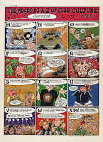
David Jukes is actually something more of a cartoon illustrator than a comic artist, although these days he dedicates most of his time producing photorealistic oil paintings that really do need to be seen to be believed. As a prolific record cover artist, he demonstrated a notable interest in comics (and pop) culture, often producing artworks somewhere in between the styles of Roy Lichtenstein and classic panel art. He once brilliantly reinterpreted the front page of a classic Eagle comic to suit the cover of a Junior Boy's Own compilation album. He should also be recognised for producing the iconic cover of the classic Pulp single "Sorted For E's & Wizz", done in the style of that '70s fashion clipart you used to get. 

David Jukes Comic Art David Jukes Comic Art David Jukes Comic Art David Jukes Comic Art

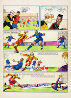
David J's comic career started around 1991, as a collaborative artist on the extremely much sought after rave clubzine Chortler's Companion. I am reliably informed that two issues of this extremely rare publication made it to print, and existing copies are currently fetching around the £75 mark. He also produced work for small press cult favourite Bastard Bunny, before getting his break producing a full-length strip in issue 29 of Deadline. He moved on to the EMAP publishing group in 1993, taking over the popular DJ Moody strip in Select Magazine, and providing strips for Roy of the Rovers Monthly a year later. After going on to work on Neon in 1996, David J had also supplied comic art for many other titles such as The DFC, Disney Big Time and Chelsea FC's Bridge Kids, as well as providing illustrations in his own inimitable style for many other mainstream publications like Q, Mixmag, It's HotSky, Minx, Robot Wars, Blue Peter, Top of the Pops, Football Magic, Walking with Dinosaurs, The Telegraph newspaper, and many more...

David Jukes Comic Art David Jukes Comic Art David Jukes Comic Art David Jukes Comic Art

Berks was a continuous strip that ran for the first twelve issues of the magazine, and tells the story of Darren Piggott, an obsessive video geek's rise from unemployable wretch to Hollywood film director. It's a humorous and very well-observed parody of Quentin Tarantino's own ascent to stardom, featuring all the nuances and idiosyncrasies associated with the cult regisseur, and includes an all-star cast of unlikely has-beens of the silver screen along the way.

Although the story itself is highly amusing, it was in fact the artwork that stood out as distinctly attractive. David J had created an individual approach to cartoonist abstraction that perfectly captured the nature of '90s youth/club culture. It was a style that reflected the t-shirt designs, the flyer art and the cd covers of the era. There's a particular verve and vivacity to the highly-defined linework, the exaggerated angles, and the effective use of varying stroke widths. It looks almost as if it was created in vector, but of course it's all hand-drawn, hand-coloured, hand-lettered, and inked to perfection. Notice the extreme attention to detail too; absolutely no space at all is wasted, and as much effort has gone into drawing the background elements as those in the fore. You won't find any short cuts in this artwork.


There are also some really fantastic and innovative touches to his comic technique too, the layouts are as experimental and challenging as you can get in mainstream publishing. An awful lot of care and artistic consideration has also gone into the overall aesthetic impact of David Jukes' strips. Even the colours and the lettering are spot on, as every aspect comes together in sheer harmony to create a page that is an ultimate work of art in itself.

David Jukes Comic Art David Jukes Comic Art David Jukes Comic Art David Jukes Comic Art

If we take a peek at some of his more recent examples, you can notice how the output has obtained a considerably cleaner and more polished look in recent years. You may also see that he has at no point abandoned his natural style, and has built on the staggering level of detail in his illustrations. This is the sign of a great progressive craftsman, and a commercial artist that has honed his already impressive skill to a state of absolute perfection.

David J favours a contemporary ligne claire style, and was developed by someone who was already providing work to this standard before it became considerably easier to do with a computer. The impact of his intricate and lucid finishes have much in common with the great US indie artist Rick Geary, but delivered with the crisp precision and discipline of Chris Ware. Had he been around a couple of decades earlier, I'm pretty certain that David Jukes would have become a household name within the UK comics scene.

David Jukes Comic Art David Jukes Comic Art David Jukes Comic Art David Jukes Comic Art

I was extremely fortunate enough to be able to get in touch with the artist himself, and deeply honoured by the fact that he was willing to take the time out to answer a few questions:
First of all, let me thank you David for taking the time to reply. I've checked out your recent work as well, and I just really love everything about your art. Have you always wanted to draw for a living?
Yes from about the age of 11 onwards. When I was very little all I wanted to do was play football, morning noon & night. If it was raining too hard I’d sit inside and draw footballers. That’s where it started I think. I’d draw little football matches and give the games a score. I was pretty gobsmacked down the road when I eventually ended up drawing Roy of the Rovers as this had been my main reference point for drawing footballers throughout my childhood. 
I imagine it must have been quite a thrill seeing your first work in a national magazine. How did you break into printed media illustration, and comic strips in particular? 
Yeah it really was a thrill. As I previously outlined with the Select Magazine episode it sorted of got going after Chortler’s, which we all worked on long, long hours in the hope something might happen. But I still think my biggest thrill early on was the 6-page strip in Deadline. It was called The American Way, I think. That was the first time I’d worked on something in the hope of getting published and taking it to an editor of an established publication and them saying Yes. 
You have a wonderfully distinctive drawing style, and your particularly impressive line art has always been a prominent feature of this. I know for a fact that in your case it is purely down to natural ability, and that it is a lot easier for people to control their drawings digitally these days. How much of a part do computers play in your art, and when did you start using them? 
I use computers a lot today. I love them. But my work has changed now as I mostly use them for photography and manipulating the image before I use it as painting reference. When I was illustrating, I always used to hand draw the image in black & white line before scanning, then colouring up. I think I was about the last illustrator I know to jump into using computers (and fax machines and mobile phones!). I was a bit of a Luddite, stuck in my ways, and stubbornly tried to hold back the waves of progress. I stuck with pen paper and Pantone markers for as long as possible (or acceptable in the publishing world). I love great digital illustration now, I still try to keep an eye on talented comic and illustration artists today. 
I've noticed a lot of pop art and comic book references in your early cover illustrations. What kind of comics have you particularly enjoyed in your lifetime, and what influences (not just comics) do you think have influenced your illustrative style? 
That’s a tough one. There’s so many comic/illustration artists that I’ve admired that it’s difficult for me to say where my main influence comes from. Within the industry I’d often flit from one style to another and I sorted of ended up being a jack-of-all-trades. At the BBC & EMAP different publications would ask me to draw something in this style or try and copy someone else’s style (for cheaper). I think because I loved so many different styles I could adapt (and enjoyed trying to replicate). So after that long winded monologue, in answer to your question maybe my 1st illustration hero (got the ball rolling) was probably Ralph Steadman. Odd really 'cos it’s the one style I never really tried to emulate (maybe I was too much in awe). 
I've seen your fantastic oil paintings, so you obviously have a great eye for detail. How do you feel this helps you in your commercial work? Are you self-taught or did you take anything from higher education, and how important do you think it is to have an appreciation of art in general to be a successful cartoon or comic artist? 
I did go to Horsham Art School after leaving school. I pretty much moved to London quite quickly after that and started illustrating. Obviously art school helps but at the end of the day I think most artists are pretty much self taught as you spend so long hours working and learning on your own. Art in general no matter what genre is massively important. With all the long hours working alone and being totally self absorbed to see and appreciate as many different artist in as many different fields is a huge help. Illustration/comic art was my first go to for influences but I found quite early on that I was fascinated with photorealism painting. I loved the detail. This with other painting influences ultimately led me to the painting direction I’ve taken in the last few years. 
Thank-you so much for taking the time to be interviewed David, it has been a real privilege and a pleasure. I wish you all the very best in your continued career.
David Jukes Illustration
Who says horses are difficult to get right?
You can (and are encouraged to) visit David Jukes' online portfolio site here.

You are also highly recommended to ensure that you are sitting comfortably, and visit his painting website here.

The Shaggy D.A. - David Lyttleton (EMAP, 1996-1997) 


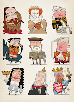
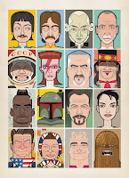
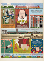
David Lyttleton is also known more for his cartoon illustrations than as an actual comic artist, although he too has been active in the ninth art. However, stylistic caricatures are very much his thing, and he has this uncanny knack of completely nailing any likeness in his own exclusively unique and distinct style.

Kling Klang Klatch - David Lyttleton
Twisted cover of a GN about a dystopian future where teddy bears are the ruling mammal.
As well as The Shaggy D.A., David Lyttleton had also produced strips for various music magazines and papers back in the day, in addition to having had work published in Max Overload!, Aliens Magazine, Red Dwarf Smegazine, Details, and provided the art for a full-length graphic novel called Kling Klang Klatch (Dark Horse), alongside frequent collaborator and Ian Harrison. As well as producing artwork for another book Rebel Science (Sterling), he has been a regular contributor with illustrations for many other mainstream publications such as NMEPunch, Vox, Time Out, Readers Digest, New Scientist, the Virgin Film Guides, and many more. He has also provided work for more national newspapers than you can think of, and even has his own font available on P22, complete with a set of snappy, hand-rendered dingbats.

David Lyttleton Comic Art David Lyttleton Comic Art David Lyttleton Comic Art David Lyttleton Comic Art

The Shaggy D.A. was a marvellously entertaining and original feature, inasmuch as it didn't really follow the traditional line of a comic strip narrative. Instead, you were presented with a sequence of standalone panels that were linked didactically, featuring a bizarre and ironic pastiche of imaginary film scenes. It was tremendous fun, and although the Ian Harrison scripts were extremely well-observed, it was once again the fantastic artwork that I would drool over.
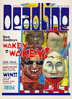
Just take a closer inspection at the use of colour and texture in his paintwork, and the juxtaposition of those detailed renderings against the stylised backgrounds. See how they blend so well together with the fractured forms in the foreground, and the lettering too is simply awesome. It's poetry... sheer beautiful, abstract poetry!

David Lyttleton Comic Art David Lyttleton Comic Art David Lyttleton Comic Art David Lyttleton Comic Art

You can quite evidently see here the basis for what would become David Lyttleton's signature style, which is again the sign of an artist on top of his game. However, this early work also has the kind of natural power and energy that is in many ways reminiscent of Ralph Steadman or Gerald Scarfe. Indeed, his work has the maintained the same level of impact right throughout the entire progression of his career, and his grotesque imagery still has the ability to haunt you, even with the simplified approach he has become more accustomed to.

You can also clearly see how this earlier work has had a distinct effect on what David L's style has become. This is clear proof of how an artist must explore (and master) different avenues during his or her career, before settling into a course of natural development.

David Lyttleton Comic Art David Lyttleton Comic Art David Lyttleton Comic Art David Lyttleton Comic Art

David Lyttleton has demonstrated an expertise in many different artistic mediums, and you get the impression that he often manages to obtain exactly what he has in his head. Whether it be computer, ink or paints, the result is always uniformly unmistakable and, more importantly, it looks fantastic. I didn't realise it was his work at the time, but I remember being extremely impressed with David L's woodcut style illustrations in the Virgin/Time Out Film Guides, in the early '90s. The meticulous detail, craftsmanship and trademark visual coordination were all there, even though it was quite different from any his comic book stuff

That isn't to say that I don't love what his style has developed into, because I do very much. This is what I have become used to seeing from him, especially since I began researching the article, and I just can't get enough it. His modern work is absolutely sensational too, and I am in constant awe of the effect he is able to achieve with such an economy of line, shape and form. I would pay good money to see an exhibition of his work. This is contemporary pop culture art at its absolute finest.

David Lyttleton Comic Art David Lyttleton Comic Art David Lyttleton Comic Art David Lyttleton Comic Art

I was also exceptionally fortunate to be able to get in touch with this artist too, and extremely privileged by the fact that he was also willing to spare the time of giving me this interview:
First of all, let me thank you for taking the time to answer my questions. I've been looking at all your work and can see that even there is natural progression in your art, although you have remained true to your original style. Have you always wanted to draw professionally?
Yes well I’ve always wanted to be an illustrator. Last year I was standing in my daughter’s classroom at Primary School (the same Primary school I went to!) and saw the desk by the window where I sat drawing a picture of a fishing trawler. I distinctly remember having a chat with my teacher and he said people can draw for a living. So I thought great, that’s for me! 
As far as natural progression goes, well it’s true, I think the way you draw is like the way you write, it’s unique and personal. I think integrity is everything. 
How did you start out as an commercial illustrator/artist, and what was the first work you ever got printed. How did it feel to see something you'd done in a magazine for the first time? 
My first commission was for Elle magazine, for the horoscopes page, but I got a job off the Radio Times just after that and that came out in print first. I nipped into my local newsagents and saw it, I can still remember how it felt, fabulous! I also remember the man who ran the art shop in town (that I frequented, naturally) also bought a copy and framed the page for me as a gift. Nice! 
I get the feeling that you are pretty much were you now want to be with your wonderful and unique style. I understand that you use vector illustration, although your painting and freehand work is virtually indistinguishable from the stuff you produce digitally. How much of a role do computers play for you personally, and how have they affected your progression as an artist? 
My work has been developing all the time from day one, a natural progression though, nothing dramatic! As you know I used to work in paint, and scraper board (for example the Time Out Film Guides you mentioned) but not for a long time now. When I did paint, I had a funny technique that I developed since leaving college, which involved priming stretched paper on board (or even canvas boards in the early days, I made them myself) then adding a sort of tone wash over it, then lifting the paint (gouache) back off again to get tones. Then I’d add transparent layers with an airbrush, acrylics and inks, and finally some solid flat colour in acrylic and add black lines. What a mad system! And all against the clock, and no room for error, just one go, not like now with Photoshop. 
When I moved out of London, I got a Mac with the sole intention of just scanning painted artwork in and emailing it to clients. But I’d look at the work on screen, and go hmmm that black line could do with straightening up, or that colour could do with being brighter… tweak tweak tweak... and bit by bit it became all digital. I moved pretty quickly onto scanning in the b/w wash artwork and adding everything else after. I only stopped that a few years ago actually, about five or six, maybe a bit more. But I still draw work out on stretched paper then scan the pencil a/w in, I’m not stopping that, it’s crucial for me to draw in pencil I think. Drawing on-screen is horrible. 
Last year I was moaning to an artist friend of mine about digital work being so ephemeral, and he suggested doing some paintings to re-connect a bit. I still had all my paints in the garage, so I did a few, but this time solid flat colour acrylic paintings, like I wish they’d always looked really. At first I did big versions of recent already-produced magazine commissions that I liked and they went well, so I’m planning more as soon as there’s time. I’ll email you some tomorrow for a peep if you like. Nice to have colourful objects to hold in your hand, that will last and can go on a wall. Very rewarding. 
As for Macs, and computers and Photoshop and all that, I have absolutely zero interest. I’m not interested in fancy effects, I just tend to do line and flat colour, an occasional bit of graduation but not much more than that. What’s important is the finished image, and how well it prints, or looks on screen, and the best way to get there, as long as it’s crisp and sharp and clean I’m happy. Everything’s a lot easier with Photoshop, you can go back time and time again to get it right, not like with paint. Actually it’s much better working on a Mac, I should be more enthusiastic. But but but... working on a Mac occasionally gives you crippling RSI… like I’ve got now. Ow! My God it’s bloody killing me! Index finger, right hand! I did my back in craning over a drawing board for years, now I’m doing it in all over again slumped in an office chair not moving for hours on end. Uh. 
You mentioned before that you wished you could do more comics now (I hope you do manage to get around to it, by the way). Have you always been interested in comics; what titles have enjoyed the most, and is there anything that has influenced your work in a particular way? 
I’d love to do more comics! I was never much of a mad comic fan really, but I loved doing the work. And again, it’d be so much easier now with everything digital. I don’t have that much experience in comics… I sort of fell into it . I did a job for an architecture magazine waaaaay back at the start of my career, and a science fiction writer saw it and liked my work, and asked his publisher to get me to do a cover for him. Anyway that fell through and I did a graphic novel instead. That was a great opportunity but the deadlines were horrendous, I hated it by the time it was half way through. Anyway that was such a long time ago. I did some comics after that, much nicer, and loads of strips for the NME, Vox, Neon and a few others. But all ancient work, I can’t bare to look at any of it. Anything older than five years or so I can’t stand! I’ve tipped all that old painted work in the bin years ago… except for a few. Haven’t done a strip in years, shame... 
As far as influences go, well, I try to NOT look at too much illustration if I can help it, I like to protect my integrity, and if you look at other people’s work it will inevitably feed into your own I think whether you want it to or not. But I suppose I’d better confess to Mike McMahon as far as comics goes, and apart from that I’d name Eyvind Earle and Charlie Harper as my favourite artists. I like medieval woodcuts and the like too, it’s all been downhill since then! The golden age of illustration. That medieval illustration of The Siege of Jerusalem… has there been a better illustration since then? No. 
As for The Shaggy D.A., Ian Harrison wrote that. I saw him this year for the first time in ages, so lovely to see him. We did a few strips together, one day perhaps someone will pay us to do some more eh! He sent me one of his recent strips that he wrote and drew, brilliant. ‘Who’s been dumping mattresses?’ it’s called. Fabulous. Whaddaguy! 
Your commercial work appears to be predominantly caricature-based. Is this the aspect of your work that you enjoy in the most, and is it self-taught, or is there any form of artistic education or grounding that has helped you in achieving this ability? 
Yes indeed, I do loads of well, ‘recognisable people’. It’s my main thing really, I love it, you have to really try hard every time. I used to do album review pics for the NME, I suppose that’s where I got started doing those, long time ago, twenty five years. There’s no knack to it, I’m not a caricaturist or anything like that, I just do pictures of people in my style. I want to do some paintings too when I get round to it, see if I can sell them, you never know. Nice! 
Thank-you very much once again for the taking the time to reply David, it has been a great pleasure and an honour. I wish you all the very best for the future.
David Lyttleton Illustration
England football legends prepare for the 2014 World Cup in Brazil
You can (and are encouraged to) visit David Lyttleton's online portfolio site here.

The Line to Follow 

Although my primary aim was to highlight the art of two creators that requires further attention, something occurred to me whilst compiling this article. I became aware of a subconscious realisation that had remained dormant for a very long time, and suddenly dawned upon me only just recently. I asked myself why had I kept a zip disk with these scans for over twenty years; why had I continued to search for more information about these strips online (with very little or no result); and above all, why had I decided I was going to write about them before I had even set up this blog. I can now safely say that through these works, both artists had been directly responsible for inspiring my own style of art and design.

I hope this doesn't come across a pretentious thing to say, as I don't profess to be a great artist or illustrator, and drawing is only a small part of my job. I don't really want to elaborate further on this aspect, because it isn't relevant. Furthermore, individual style can be a very personal and subjective concept. It is possible that no-one else but myself would be a able to visualise these influences, but it is something I can confirm with complete and utter conviction.

I took example from David Jukes' style of cartoonist abstraction, defined and angular line art, as well as being fascinated by his particular attention to detail, and by his use of different stroke widths to emphasise depth. From David Lyttleton, I extracted some of his leftfield graphical technique, and the concept of translating a great deal of information from a minimal amount of (almost) geometrical shapes, using a similar approach in producing caricatures of my own. Each of these lessons were gathered subliminally, and have remained within me ever since. Looking back, these two artists had probably influenced me more directly than anyone else I was required to study during my time at art college.

In any case, the point of this statement is to demonstrate that you don't need to draw influences from the latest arthouse graphic novel, or from an old Spider-Man or Fantastic Four comic. There's absolutely nothing wrong with that of course. Nothing at all. I just want to make the point that inspiration is all around us, and can often be obtained from the most unlikely of sources (with all due respect).

Of course, you don't have to be a creative to appreciate the funnies, the cartoons and the illustrations you see in magazines, newspapers, or even in adverts. All I ask is that you pay them more attention, and remember that the periodicals we read would become terribly drab and boring affairs without them. As for the strips... well, they're comics too, you know. And I challenge anyone who says otherwise!

If either of the artists have managed to get this far, I  hope you will each seriously consider the possibility of eventually releasing a big, thick coffee table artbook, and with everything included in it!

All visual content is for demonstrative purposes only and is the property of the respective owners.