Neon - UK Movie Magazine (EMAP, 1996-1999)
A rare look at the cartoons and artists that influenced and helped elevate this publication to British cult status. Warning: includes some of the most obscure comic material known to man; anyone who is sensitive to such matter is encouraged to look away now.
Funnies on the Slide
 |
| Best of both worlds: flicking through the movie panels. |
Do you remember when it was commonplace to find comic strips in magazines?... It really wasn't all that long ago. Publications of every description used to feature them regularly, and it was quite normal to expect to find one or two-page strips in everything from computer, movie, sport, TV and music magazines; right through to even the more specialist areas, such as the various gentlemen's interest periodicals that would populate the newsagent's top shelf (so I've been told!). Some of the British newspapers would even provide an American-style supplementary pull-out section of comics and cartoons, until about a decade or so ago. It would appear that even the classic funny strip has faced a gradual decline in many of the dailies too, over recent years, and is slowly dying out completely.
Neon was a short-lived, but well-loved monthly to the dedicated few that stuck with it throughout its run. Unlike established titles such as Empire, Sight & Sound, and (later) Total Film, it provided a more accessible and alternative look at the movie world. Neon concentrated much of its content on classic and cult cinema, with less hype surrounding blockbuster or mainstream releases. It didn't take itself (or the subject matter) too seriously, and also provided an important cultural subtext to its articles and reviews. The magazine appealed to the casual film fan, as well as to those with a more advanced interest in the medium. It provided a niche for readers who wanted to treat their passion with a refreshing and new outlook, and that was perhaps unavailable elsewhere.
I came in somewhere between the two levels of reader demographics, although my main reason for buying it was for the most abso-fucking-lutely brilliant posters they used give away free. In fact, that's what probably put them out of business. I was also a sucker for a good comic strip (and still am!). Neon had not one, but two humorous and superbly drawn strips for me to look forward to, and they were both just beautiful!
 |
| The classic (remixed) cover to issue 9 of Neon, just to jog a few memories... |
Berks - David Jukes (EMAP, 1996-1997)
The first comic strip we're going to take a look at was called "Berks", which is not only rhyming slang for an exceptionally rude word, but also a play on the popular Kevin Smith movie title of the time, "Clerks". This is the artist that I had tremendous difficulty in pinning down, even though he signed his work rather neatly in the bottom left-hand corner of the page. The main problem was that the small text was impossible for me to make out, in my surviving low-res scans of the strip. In the end, a complete shot in the dark led me to associate the art style with "Dave" Juke's illustration from a 1992 CD featuring The Pharcyde's classic cuss-hop anthem, "Ya Mama". Although I adore this single, I had actually originally bought it on the strength of the cover alone.
 |
| "Ya mama's got a glass eye, wit' a fish in it. Ya mama, ya mama, ya mama." |
 |  |  |  |
David J's comic career started around 1991, as a collaborative artist on the extremely much sought after rave clubzine Chortler's Companion. I am reliably informed that two issues of this extremely rare publication made it to print, and existing copies are currently fetching around the £75 mark. He also produced work for small press cult favourite Bastard Bunny, before getting his break producing a full-length strip in issue 29 of Deadline. He moved on to the EMAP publishing group in 1993, taking over the popular DJ Moody strip in Select Magazine, and providing strips for Roy of the Rovers Monthly a year later. After going on to work on Neon in 1996, David J had also supplied comic art for many other titles such as The DFC, Disney Big Time and Chelsea FC's Bridge Kids, as well as providing illustrations in his own inimitable style for many other mainstream publications like Q, Mixmag, It's Hot, Sky, Minx, Robot Wars, Blue Peter, Top of the Pops, Football Magic, Walking with Dinosaurs, The Telegraph newspaper, and many more...
 |  |  |  |
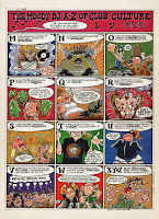
Berks was a continuous strip that ran for the first twelve issues of the magazine, and tells the story of Darren Piggott, an obsessive video geek's rise from unemployable wretch to Hollywood film director. It's a humorous and very well-observed parody of Quentin Tarantino's own ascent to stardom, featuring all the nuances and idiosyncrasies associated with the cult regisseur, and includes an all-star cast of unlikely has-beens of the silver screen along the way.
Although the story itself is highly amusing, it was in fact the artwork that stood out as distinctly attractive. David J had created an individual approach to cartoonist abstraction that perfectly captured the nature of '90s youth/club culture. It was a style that reflected the t-shirt designs, the flyer art and the cd covers of the era. There's a particular verve and vivacity to the highly-defined linework, the exaggerated angles, and the effective use of varying stroke widths. It looks almost as if it was created in vector, but of course it's all hand-drawn, hand-coloured, hand-lettered, and inked to perfection. Notice the extreme attention to detail too; absolutely no space at all is wasted, and as much effort has gone into drawing the background elements as those in the fore. You won't find any short cuts in this artwork.
There are also some really fantastic and innovative touches to his comic technique too, the layouts are as experimental and challenging as you can get in mainstream publishing. An awful lot of care and artistic consideration has also gone into the overall aesthetic impact of David Jukes' strips. Even the colours and the lettering are spot on, as every aspect comes together in sheer harmony to create a page that is an ultimate work of art in itself.
 | 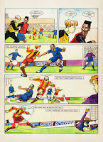 |  |  |
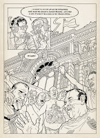
If we take a peek at some of his more recent examples, you can notice how the output has obtained a considerably cleaner and more polished look in recent years. You may also see that he has at no point abandoned his natural style, and has built on the staggering level of detail in his illustrations. This is the sign of a great progressive craftsman, and a commercial artist that has honed his already impressive skill to a state of absolute perfection.
David J favours a contemporary ligne claire style, and was developed by someone who was already providing work to this standard before it became considerably easier to do with a computer. The impact of his intricate and lucid finishes have much in common with the great US indie artist Rick Geary, but delivered with the crisp precision and discipline of Chris Ware. Had he been around a couple of decades earlier, I'm pretty certain that David Jukes would have become a household name within the UK comics scene.
 |  |  |  |
I was extremely fortunate enough to be able to get in touch with the artist himself, and deeply honoured by the fact that he was willing to take the time out to answer a few questions:
First of all, let me thank you David for taking the time to reply. I've checked out your recent work as well, and I just really love everything about your art. Have you always wanted to draw for a living?
Yes from about the age of 11 onwards. When I was very little all I wanted to do was play football, morning noon & night. If it was raining too hard I’d sit inside and draw footballers. That’s where it started I think. I’d draw little football matches and give the games a score. I was pretty gobsmacked down the road when I eventually ended up drawing Roy of the Rovers as this had been my main reference point for drawing footballers throughout my childhood.
I imagine it must have been quite a thrill seeing your first work in a national magazine. How did you break into printed media illustration, and comic strips in particular?
Yeah it really was a thrill. As I previously outlined with the Select Magazine episode it sorted of got going after Chortler’s, which we all worked on long, long hours in the hope something might happen. But I still think my biggest thrill early on was the 6-page strip in Deadline. It was called The American Way, I think. That was the first time I’d worked on something in the hope of getting published and taking it to an editor of an established publication and them saying Yes.
You have a wonderfully distinctive drawing style, and your particularly impressive line art has always been a prominent feature of this. I know for a fact that in your case it is purely down to natural ability, and that it is a lot easier for people to control their drawings digitally these days. How much of a part do computers play in your art, and when did you start using them?
I use computers a lot today. I love them. But my work has changed now as I mostly use them for photography and manipulating the image before I use it as painting reference. When I was illustrating, I always used to hand draw the image in black & white line before scanning, then colouring up. I think I was about the last illustrator I know to jump into using computers (and fax machines and mobile phones!). I was a bit of a Luddite, stuck in my ways, and stubbornly tried to hold back the waves of progress. I stuck with pen paper and Pantone markers for as long as possible (or acceptable in the publishing world). I love great digital illustration now, I still try to keep an eye on talented comic and illustration artists today.
I've noticed a lot of pop art and comic book references in your early cover illustrations. What kind of comics have you particularly enjoyed in your lifetime, and what influences (not just comics) do you think have influenced your illustrative style?
That’s a tough one. There’s so many comic/illustration artists that I’ve admired that it’s difficult for me to say where my main influence comes from. Within the industry I’d often flit from one style to another and I sorted of ended up being a jack-of-all-trades. At the BBC & EMAP different publications would ask me to draw something in this style or try and copy someone else’s style (for cheaper). I think because I loved so many different styles I could adapt (and enjoyed trying to replicate). So after that long winded monologue, in answer to your question maybe my 1st illustration hero (got the ball rolling) was probably Ralph Steadman. Odd really 'cos it’s the one style I never really tried to emulate (maybe I was too much in awe).
I've seen your fantastic oil paintings, so you obviously have a great eye for detail. How do you feel this helps you in your commercial work? Are you self-taught or did you take anything from higher education, and how important do you think it is to have an appreciation of art in general to be a successful cartoon or comic artist?
I did go to Horsham Art School after leaving school. I pretty much moved to London quite quickly after that and started illustrating. Obviously art school helps but at the end of the day I think most artists are pretty much self taught as you spend so long hours working and learning on your own. Art in general no matter what genre is massively important. With all the long hours working alone and being totally self absorbed to see and appreciate as many different artist in as many different fields is a huge help. Illustration/comic art was my first go to for influences but I found quite early on that I was fascinated with photorealism painting. I loved the detail. This with other painting influences ultimately led me to the painting direction I’ve taken in the last few years.
Thank-you so much for taking the time to be interviewed David, it has been a real privilege and a pleasure. I wish you all the very best in your continued career.
 |
| Who says horses are difficult to get right? |
You are also highly recommended to ensure that you are sitting comfortably, and visit his painting website here.
The Shaggy D.A. - David Lyttleton (EMAP, 1996-1997)
David Lyttleton is also known more for his cartoon illustrations than as an actual comic artist, although he too has been active in the ninth art. However, stylistic caricatures are very much his thing, and he has this uncanny knack of completely nailing any likeness in his own exclusively unique and distinct style.
 |
| Twisted cover of a GN about a dystopian future where teddy bears are the ruling mammal. |
 |  |  |  |
The Shaggy D.A. was a marvellously entertaining and original feature, inasmuch as it didn't really follow the traditional line of a comic strip narrative. Instead, you were presented with a sequence of standalone panels that were linked didactically, featuring a bizarre and ironic pastiche of imaginary film scenes. It was tremendous fun, and although the Ian Harrison scripts were extremely well-observed, it was once again the fantastic artwork that I would drool over.
Just take a closer inspection at the use of colour and texture in his paintwork, and the juxtaposition of those detailed renderings against the stylised backgrounds. See how they blend so well together with the fractured forms in the foreground, and the lettering too is simply awesome. It's poetry... sheer beautiful, abstract poetry!
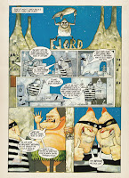 |  |  |  |
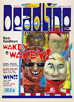
You can quite evidently see here the basis for what would become David Lyttleton's signature style, which is again the sign of an artist on top of his game. However, this early work also has the kind of natural power and energy that is in many ways reminiscent of Ralph Steadman or Gerald Scarfe. Indeed, his work has the maintained the same level of impact right throughout the entire progression of his career, and his grotesque imagery still has the ability to haunt you, even with the simplified approach he has become more accustomed to.
You can also clearly see how this earlier work has had a distinct effect on what David L's style has become. This is clear proof of how an artist must explore (and master) different avenues during his or her career, before settling into a course of natural development.
 |
 |
 |
 |
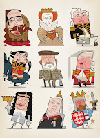
David Lyttleton has demonstrated an expertise in many different artistic mediums, and you get the impression that he often manages to obtain exactly what he has in his head. Whether it be computer, ink or paints, the result is always uniformly unmistakable and, more importantly, it looks fantastic. I didn't realise it was his work at the time, but I remember being extremely impressed with David L's woodcut style illustrations in the Virgin/Time Out Film Guides, in the early '90s. The meticulous detail, craftsmanship and trademark visual coordination were all there, even though it was quite different from any his comic book stuff.
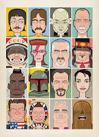
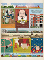
That isn't to say that I don't love what his style has developed into, because I do very much. This is what I have become used to seeing from him, especially since I began researching the article, and I just can't get enough it. His modern work is absolutely sensational too, and I am in constant awe of the effect he is able to achieve with such an economy of line, shape and form. I would pay good money to see an exhibition of his work. This is contemporary pop culture art at its absolute finest.
 |
 |
 |
 |
I was also exceptionally fortunate to be able to get in touch with this artist too, and extremely privileged by the fact that he was also willing to spare the time of giving me this interview:
First of all, let me thank you for taking the time to answer my questions. I've been looking at all your work and can see that even there is natural progression in your art, although you have remained true to your original style. Have you always wanted to draw professionally?
Yes well I’ve always wanted to be an illustrator. Last year I was standing in my daughter’s classroom at Primary School (the same Primary school I went to!) and saw the desk by the window where I sat drawing a picture of a fishing trawler. I distinctly remember having a chat with my teacher and he said people can draw for a living. So I thought great, that’s for me!
As far as natural progression goes, well it’s true, I think the way you draw is like the way you write, it’s unique and personal. I think integrity is everything.
How did you start out as an commercial illustrator/artist, and what was the first work you ever got printed. How did it feel to see something you'd done in a magazine for the first time?
My first commission was for Elle magazine, for the horoscopes page, but I got a job off the Radio Times just after that and that came out in print first. I nipped into my local newsagents and saw it, I can still remember how it felt, fabulous! I also remember the man who ran the art shop in town (that I frequented, naturally) also bought a copy and framed the page for me as a gift. Nice!
I get the feeling that you are pretty much were you now want to be with your wonderful and unique style. I understand that you use vector illustration, although your painting and freehand work is virtually indistinguishable from the stuff you produce digitally. How much of a role do computers play for you personally, and how have they affected your progression as an artist?
My work has been developing all the time from day one, a natural progression though, nothing dramatic! As you know I used to work in paint, and scraper board (for example the Time Out Film Guides you mentioned) but not for a long time now. When I did paint, I had a funny technique that I developed since leaving college, which involved priming stretched paper on board (or even canvas boards in the early days, I made them myself) then adding a sort of tone wash over it, then lifting the paint (gouache) back off again to get tones. Then I’d add transparent layers with an airbrush, acrylics and inks, and finally some solid flat colour in acrylic and add black lines. What a mad system! And all against the clock, and no room for error, just one go, not like now with Photoshop.
When I moved out of London, I got a Mac with the sole intention of just scanning painted artwork in and emailing it to clients. But I’d look at the work on screen, and go hmmm that black line could do with straightening up, or that colour could do with being brighter… tweak tweak tweak... and bit by bit it became all digital. I moved pretty quickly onto scanning in the b/w wash artwork and adding everything else after. I only stopped that a few years ago actually, about five or six, maybe a bit more. But I still draw work out on stretched paper then scan the pencil a/w in, I’m not stopping that, it’s crucial for me to draw in pencil I think. Drawing on-screen is horrible.
Last year I was moaning to an artist friend of mine about digital work being so ephemeral, and he suggested doing some paintings to re-connect a bit. I still had all my paints in the garage, so I did a few, but this time solid flat colour acrylic paintings, like I wish they’d always looked really. At first I did big versions of recent already-produced magazine commissions that I liked and they went well, so I’m planning more as soon as there’s time. I’ll email you some tomorrow for a peep if you like. Nice to have colourful objects to hold in your hand, that will last and can go on a wall. Very rewarding.
As for Macs, and computers and Photoshop and all that, I have absolutely zero interest. I’m not interested in fancy effects, I just tend to do line and flat colour, an occasional bit of graduation but not much more than that. What’s important is the finished image, and how well it prints, or looks on screen, and the best way to get there, as long as it’s crisp and sharp and clean I’m happy. Everything’s a lot easier with Photoshop, you can go back time and time again to get it right, not like with paint. Actually it’s much better working on a Mac, I should be more enthusiastic. But but but... working on a Mac occasionally gives you crippling RSI… like I’ve got now. Ow! My God it’s bloody killing me! Index finger, right hand! I did my back in craning over a drawing board for years, now I’m doing it in all over again slumped in an office chair not moving for hours on end. Uh.
You mentioned before that you wished you could do more comics now (I hope you do manage to get around to it, by the way). Have you always been interested in comics; what titles have enjoyed the most, and is there anything that has influenced your work in a particular way?
I’d love to do more comics! I was never much of a mad comic fan really, but I loved doing the work. And again, it’d be so much easier now with everything digital. I don’t have that much experience in comics… I sort of fell into it . I did a job for an architecture magazine waaaaay back at the start of my career, and a science fiction writer saw it and liked my work, and asked his publisher to get me to do a cover for him. Anyway that fell through and I did a graphic novel instead. That was a great opportunity but the deadlines were horrendous, I hated it by the time it was half way through. Anyway that was such a long time ago. I did some comics after that, much nicer, and loads of strips for the NME, Vox, Neon and a few others. But all ancient work, I can’t bare to look at any of it. Anything older than five years or so I can’t stand! I’ve tipped all that old painted work in the bin years ago… except for a few. Haven’t done a strip in years, shame...
As far as influences go, well, I try to NOT look at too much illustration if I can help it, I like to protect my integrity, and if you look at other people’s work it will inevitably feed into your own I think whether you want it to or not. But I suppose I’d better confess to Mike McMahon as far as comics goes, and apart from that I’d name Eyvind Earle and Charlie Harper as my favourite artists. I like medieval woodcuts and the like too, it’s all been downhill since then! The golden age of illustration. That medieval illustration of The Siege of Jerusalem… has there been a better illustration since then? No.
As for The Shaggy D.A., Ian Harrison wrote that. I saw him this year for the first time in ages, so lovely to see him. We did a few strips together, one day perhaps someone will pay us to do some more eh! He sent me one of his recent strips that he wrote and drew, brilliant. ‘Who’s been dumping mattresses?’ it’s called. Fabulous. Whaddaguy!
Your commercial work appears to be predominantly caricature-based. Is this the aspect of your work that you enjoy in the most, and is it self-taught, or is there any form of artistic education or grounding that has helped you in achieving this ability?
Yes indeed, I do loads of well, ‘recognisable people’. It’s my main thing really, I love it, you have to really try hard every time. I used to do album review pics for the NME, I suppose that’s where I got started doing those, long time ago, twenty five years. There’s no knack to it, I’m not a caricaturist or anything like that, I just do pictures of people in my style. I want to do some paintings too when I get round to it, see if I can sell them, you never know. Nice!
Thank-you very much once again for the taking the time to reply David, it has been a great pleasure and an honour. I wish you all the very best for the future.
 |
| England football legends prepare for the 2014 World Cup in Brazil |
The Line to Follow
Although my primary aim was to highlight the art of two creators that requires further attention, something occurred to me whilst compiling this article. I became aware of a subconscious realisation that had remained dormant for a very long time, and suddenly dawned upon me only just recently. I asked myself why had I kept a zip disk with these scans for over twenty years; why had I continued to search for more information about these strips online (with very little or no result); and above all, why had I decided I was going to write about them before I had even set up this blog. I can now safely say that through these works, both artists had been directly responsible for inspiring my own style of art and design.I hope this doesn't come across a pretentious thing to say, as I don't profess to be a great artist or illustrator, and drawing is only a small part of my job. I don't really want to elaborate further on this aspect, because it isn't relevant. Furthermore, individual style can be a very personal and subjective concept. It is possible that no-one else but myself would be a able to visualise these influences, but it is something I can confirm with complete and utter conviction.
I took example from David Jukes' style of cartoonist abstraction, defined and angular line art, as well as being fascinated by his particular attention to detail, and by his use of different stroke widths to emphasise depth. From David Lyttleton, I extracted some of his leftfield graphical technique, and the concept of translating a great deal of information from a minimal amount of (almost) geometrical shapes, using a similar approach in producing caricatures of my own. Each of these lessons were gathered subliminally, and have remained within me ever since. Looking back, these two artists had probably influenced me more directly than anyone else I was required to study during my time at art college.
In any case, the point of this statement is to demonstrate that you don't need to draw influences from the latest arthouse graphic novel, or from an old Spider-Man or Fantastic Four comic. There's absolutely nothing wrong with that of course. Nothing at all. I just want to make the point that inspiration is all around us, and can often be obtained from the most unlikely of sources (with all due respect).
Of course, you don't have to be a creative to appreciate the funnies, the cartoons and the illustrations you see in magazines, newspapers, or even in adverts. All I ask is that you pay them more attention, and remember that the periodicals we read would become terribly drab and boring affairs without them. As for the strips... well, they're comics too, you know. And I challenge anyone who says otherwise!
If either of the artists have managed to get this far, I hope you will each seriously consider the possibility of eventually releasing a big, thick coffee table artbook, and with everything included in it!
All visual content is for demonstrative purposes only and is the property of the respective owners.

No comments:
Post a Comment